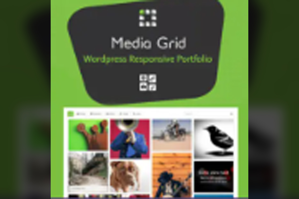
Media Grid WordPress Responsive Portfolio is the perfect solution for WordPress users who want to display their content in a visually stunning, highly customizable grid layout. Whether you’re a photographer, designer, artist, or anyone showcasing a portfolio, this powerful plugin will help you create engaging, responsive portfolios and galleries that work seamlessly across all devices.
This versatile plugin allows you to build responsive grids for your images, videos, and other types of media, all while maintaining full control over the design and functionality. With a wide array of customization options, Media Grid helps you create a unique and professional online portfolio without any coding knowledge.
Key features of Media Grid WordPress Responsive Portfolio include:
Fully Responsive Grids: Media Grid ensures that your portfolio looks great on any device, whether it's a desktop, tablet, or smartphone. With its fully responsive layout, your content will automatically adjust to different screen sizes.
Advanced Filtering & Sorting: Organize your media with advanced filtering and sorting options. Viewers can easily navigate through your portfolio, making it easier to find specific content based on categories, tags, or other custom criteria.
Customizable Layouts: Choose from a variety of grid layouts or create your own. You can adjust the number of columns, grid size, and other settings to create a unique presentation that reflects your style.
Image and Video Support: In addition to images, Media Grid allows you to showcase videos, making it ideal for creatives who work with multimedia content. Videos from YouTube, Vimeo, or self-hosted files can be displayed in the grid.
Lightbox & Hover Effects: Enhance the user experience with integrated lightbox and hover effects. These features help to highlight individual pieces of your portfolio and provide an interactive, visually engaging experience for viewers.
Drag and Drop Interface: The easy-to-use drag-and-drop interface lets you quickly organize and manage your media items. Rearranging images and videos in your grid has never been easier.
Content Previews: Display your content with captivating previews that encourage users to explore your portfolio further. You can add descriptions, captions, and links to each item in your grid.
SEO Optimized: Media Grid is built with SEO best practices in mind. By showcasing your content in an optimized way, it helps improve the visibility of your portfolio on search engines, driving more organic traffic to your site.
Fast and Lightweight: The plugin is optimized for performance, ensuring that your portfolio loads quickly even with large image galleries. This is essential for retaining visitors and improving your website’s user experience.
Whether you are a professional photographer, a creative agency, or a digital artist, Media Grid WordPress Responsive Portfolio is the ideal tool to showcase your work beautifully and professionally. The plugin gives you full control over your portfolio’s design, functionality, and layout, ensuring a flawless presentation for your audience.
Create a standout portfolio or gallery today with Media Grid, and impress your visitors with a smooth, visually appealing experience.
Subscribe to access Multiple downloads of themes, plugins, CMS Templates, HTML Templates, and more premium assets for your creative needs.
Published:
May 03, 2025 05:47 PM
Version:
v8.3.0
Category: